Saatchi & Saatchi Design

Brand identity, positioning and design communications.

Portfolio Tips for Design Students

We see a lot of student work at Saatchi & Saatchi Design. But no matter how great the work may be, simple mistakes in presenting your work can be distracting and frustrating. The ones who get the portfolio right are already one step ahead of their peers. So we thought we’d share some tips to help you make your portfolio show your work in the best light possible. Follow the tips below and let your work speak for itself.

  1. Keep it relevant. Demonstrate your understanding of the company you’re applying to – for example at Saatchi & Saatchi Design we are branding-focused with a corporate bias. Put your work in the relevant discipline up front. Show us you’ve done your homework and aren’t sending us the same file to a dozen other agencies. This doesn’t mean you should exclude your work in other disciplines (e.g. photography, illustration, etc) but keep in mind you portfolio should convince the recipient that you are as a good fit for what they do.
  2. Show multiple applications. Consider the breadth of real world applications. A single logo and letter head only tell part of a story. Show a wide variety of applications, e.g. signage, vehicle graphics, TV idents, website and social networking pages. Take a look at the student work at Brand New Classroom for some great examples.
  3. Let your work breathe. Focus only on one project per spread, but don’t feel limited to just one spread if the project merits.
  4. Give proper credit. If you’ve worked on group projects, let us know which aspects you worked on.
  5. Label your file clearly. Make sure your name and contact details are in the folios of every page of your document. If your file gets printed out and shown around, you want people to easily identify you and know how to get in contact with you.
  6. Send a single pdf file. Pdf is an industry standard format and can be read on mobile devices. Avoid Word documents, or multiple jpgs.
  7. Keep your file around 5Mb, no larger than 7Mb. Many corporate email clients can’t accept attachments larger than 10Mb, so you want to keep well under. Make sure you optimise your pdf export settings, use RGB rather than CMYK (3 colour channels take less space than 4) and set your JPG compression accordingly. Avoid rasterising vector graphics except in the case of extremely complex work. For more information on optimising the size of your pdfs take a look at this tutorial on the pdf optimiser tool.
  8. If you have a portfolio website, still send a pdf file. Sometimes being able to print a self-contained document is just easier. Send us a selection of your best work in a pdf and link it to your website for anyone who wants to take a more in-depth look later on.
  9. Put your CV at the end of the document. Your work is far more important than your CV. Let your work to show us your skills. Keep the CV to a single page and keep it at the end of your pdf.

Saatchi & Saatchi Design is currently accepting applications for student placements. All submissions should be emailed here. Unfortunately only current students who have not yet completed their studies are eligible. If you have already graduated, please send your work samples here, where we will keep your application on file for consideration should any graduate positions open up.

Please note, due to to the number of applications we receive we may not be able to respond to everybody immediately. Good luck!

Filed under: Tips, , , , , , ,

20 top tips for designing effective brand guidelines

  1. First understand:
    • Who will be using the guidelines
    • What they will gain from using them
    • Where & how it will be accessed
    • Why the guidelines are being produced
  2. If it’s being targeted at an in-house design team, then involve them from the beginning.
  3. Pick up one big idea which permeates the brand. Explain how following the brand guidelines will help communicate this idea to your brand’s key audiences.
  4. Live the brand; design the guidelines in the look and feel of the new brand design.
  5. Before working on details, first create a pagination and have it signed off.
  6. Create a clear section numbering system make clear reference to it in the body copy.
  7. Create section dividers containing a table of contents for each section.
  8. Have a clear introduction upfront to explain why the guidelines have been produced and how adhering to them will strengthen your brand.
  9. Guide, don’t tell. Engage the user. Tone of voice is key, so keep it short and simple to understand. Depending on your brand, some light-hearted copy in key places can keep it fun and creative.
  10. Have a clear typographic hierarchy. A three tier typographic platform works best, i.e. 1. Headings, 2. Introduction copy,  3. Body copy.
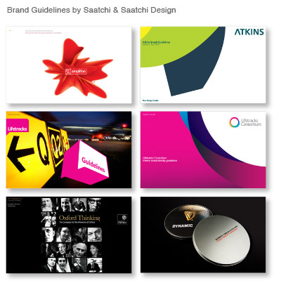
  11. Brand Guidelines by Saatchi & Saatchi Design

  12. Make rules flexible enough for designers to be creative but rigid enough to keep the brand easily recognisable. Occasionally situations will call for rules to be bent, but never broken. Continuity is key, especially if you need the brand to breath and extend across multiple media.
  13. Digital distribution is now common, so you needn’t be restricted to a limited pagination. For clarity, try to express only one or two key messages per page.
  14. Provide a Toolkit to help the designers get started. This should be a single page overview of your brand look and feel, and including your identity, colours, typographic treatment, imagery and other graphic devices.
  15. Show clear examples of how the brand should look across a full range of different media.
  16. If your brand has been mishandled in the past, consider including a Don’t Do section, showcasing common errors.
  17. When distributing digitally, create an interactive pdf. Hyperlinking your table of contents, email and web addresses will greatly improve usability. Create these in the Master InDesign File and not within Acrobat, to save having to repeat the process with each revision.
  18. Basic contents for brand guidelines should include:
    • Contents
    • Introduction
    • Company Values or Spirit
    • The Big Idea
    • Toolkit
    • Identity
    • Identity Clear Space
    • Copywriting and Tone of Voice
    • Colours
    • Typography
    • Photography
    • Graphic Devices
    • Layout and Grids
    • Applications
    • Overview with examples
    • Further Information
    • Contacts
    • Glossary
  19. More detailed brand guidelines may include:
    • Signage
    • Advertising
    • Stationery
    • Digital and Web
    • Merchandise
    • Co Branding
    • Cultural or Behavioural directions for staff training.
  20. Have your Management Team sign off all design at key stages before going public.
  21. Brand guidelines will not be enforced automatically. Be sure to schedule a review after the launch of your guidelines to ensure that they are being followed and to see where any problem areas may be occurring.

Filed under: Branding, Tips, , , ,